Logo design has a rich history that dates back centuries. However, for the past decade or so and even more so currently, people's perception about the value of logos has devolved to impersonal graphics that can be bought on Fiverr or created with AI. Is there any value left in professional logo design? Any reason for small business owners to pay for the experience of a professional designer?
Well, we are biased of course, however a quick history of logos might prove a compelling argument even for the non-biased.
What were the earliest logos?
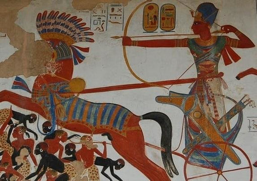
We wouldn't really call them logos in the modern parlance, however the Ancient Egyptian cartouches of pharaos and queens around 2200 BC were probably some of the earliest forms of personal branding.
Around 500 years BC affluent Greek citizens used seals to sign or endorse documents. Essential to the political economy of the region spreading with trade in all directions, seals, for several millennia, were used as a method of designating signature, private property, ownership and authority. In fact, the word ‘logo,’ which is short for ‘logotype,’ comes from Ancient Greek—lógos meaning ‘word, speech’ and túpos meaning ‘mark, imprint.’
Starting around the 8th century BC, Greek artisans began to sign ceramics and other crafted items with increasing frequency. Like most inscriptions, there was a formula to follow, often including the Greek verb ‘ποιεῖν’ (“to make”). The formula for providing a signature was typically “[Name] made this.” Occasionally the piece simply bore the name of the artisan. A famous instance of an artisan signing his work was this trompe l'oeil detail on a mosaic from the 2nd century BC, originally from a palace on the Acropolis at Pergamon and it bears the signature of a mosaicist named Hephaistion.
Seal type amulets have been found even in earlier civilisations, such as the Neolithic clay amulet of the Tărtăria tablets set, dated to 5500-5300 BC and associated with the Turdaş-Vinča culture. The Vinča symbols on it predate the proto-Sumerian pictographic script. The amulet below has been found buried with what is thought to have been a female shaman or important person. The meaning is unknown, but it is likely it reflected something meaningful in a culture that is not actually supposed to have invented writing.
In Ancient Rome Aes signatum (Latin; lit. 'stamped bronze') consisted of cast ingots of bronze of measured quality and weight, embossed with a government stamp, used as currency in Rome and central Italy starting in the 5th century BC. The stamp features a very distinctive image of a branch with side branches radiating from it, called ramo secco ("dry branch"). The Romans also brought to us the word “signature”, which comes from the Latin verb signo. A signaturum is something about to be sealed or marked off.
In China, the Heirloom Seal of the Realm was created in 221BC and served as the imperial Chinese seal throughout the next millennium of Chinese history, and its possession was seen as a physical symbol of the Mandate of Heaven.
Fundamentally, a logo is really just a symbol. Or as my beloved semiologist Umberto Eco would say, a sign. "The sign is used to transmit information; to say or to indicate a thing that someone knows and wants others to know as well" (Eco 1988, 27).
And people always wanted other people to be informed of things. Mostly of their own ownership of things, their status, their power, their family or tribe belonging etc. One finds these signs scattered throughout the history of humanity.
The Middle Ages
Between 1300-1600 AD, the signs became more concise and specific: heraldry came about and at the other end of the social spectrum, beer producers (often pubs) started to use pictograms to link batches of beer to their own establishments.
In 1366, a Dutch brewery named Den Hoorn established itself in Leuven, Belgium, and started using an image of a - you guessed it - horn to represent its beer. The brewery was sold to brewer Sebastian Artois, and the image of the horn endured. In fact, you're probably very familiar with it, as it still exists today under the name of Stella Artois.
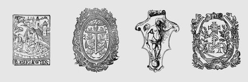
In 1462 the oldest verified printers’ mark of Fust and Schoeffer, printers from Meinz, is used it in a Bible. They were the first printers to use such an instrument for protecting from piracy, that also served as a symbol of quality. Printers marks continued to be used for centuries after and so the commercial context of the logo was established.
The design of a printer’s mark used visual puns, wordplay or sometimes a rebus, a puzzle combining illustrations and letters to depict a motto or printer’s initials. Sacred symbols, the cross and the orb, real and mythical animals, heraldic symbols, and scientific instruments were used in thousands of combinations.
You are sure to know at least one printers mark that is still in usage: Penguin.
When did modern logo design begin?
Modern logo design usage accelerated starting with the Industrial Revolution. This era left us logos such as Coca Cola (1885), Twinings (1887), Levi Strauss (1892) and Shell Oil (1906).
By the 1800s, advancements in printing meant that colour printing became affordable and available for the first time ever in mass, allowing companies to make labels, advertisements, and posters to capture their audience.
Pauls Rand's logo design for IBM in 1956 marked a significant turn in the logo design: logos transcended beyond simple brand recognition and started to become imbued with emotion and meaning.
The MTV logo marked another evolution in logo usage and design, pioneering the creation of a logo that was ever changeable and could be charged with multiple meanings and emotions.
The Google doodle, Nike swoosh and the Apple apple play similar roles and are equally versatile.
So what role do logos play in branding nowadays?
“A logo derives meaning from the quality of the thing it symbolises, not the other way around.” said Paul Rand and this is probably the most concise observation one can make about the future of logos.
The logo has arrived at a point in its history where it can continue to be nothing more than an identifier - or can aspire to be much more. A vehicle of emotion, a carrier of ever changing messages (Google anyone?), or a versatile graphic element that can draw customers in via creative displays, animations, interactions, etc
I don't think any one of us knows where logos are headed, but millennia of human history show us that humans need identifiers and logos aren't going anywhere. It will be fascinating to see how they evolve.
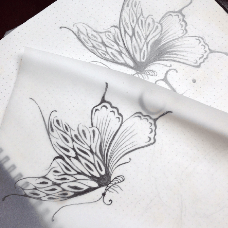
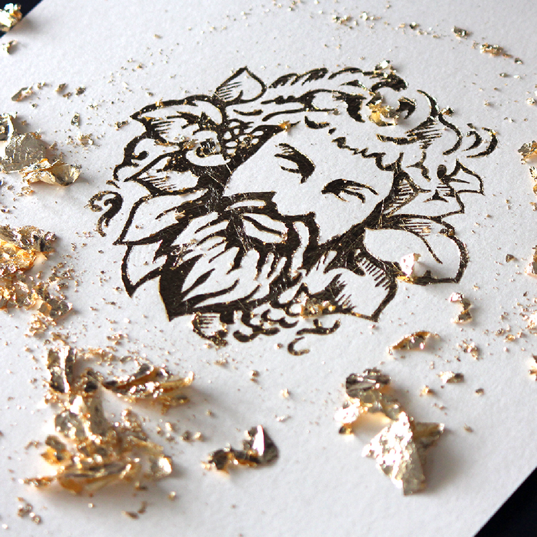
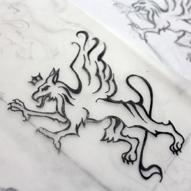
In the meanwhile a good logo still has to be distinctive, versatile, recognisable, emotionally engaging if possible and appropriate and representative of the brand it spearheads. A tall ask for any designer, and thankfully still beyond of reach of AI. For now.
Colour testing is a crucial aspect of design, especially when working with clients who have specific colour preferences or requirements. Colour evokes emotion in people, and more often than not that emotion is tied up indelibly in the clients' decision making process when it comes to design.
The problem is, we don't all see the same thing. Computer monitor calibration matters, and so does natural ability to perceive colours accurately.
Color blindness is more common than you might think. It is estimated that there are 300 million color blind people in the world! 1 in 12 men is color blind while only 1 in 200 women have the condition.
If you're curious how a colour blind person sees the world, you can use the simulator over at:
https://www.colorblindguide.com/color-blindness-simulator
If you're interested in testing your own colour vision, The Farnsworth–Munsell 100 Hue Color Vision test is often used to test for colour blindness both in a medical setting and in recruitment The system was developed by Dean Farnsworth in the 1940s and it tests the ability to isolate and arrange minute differences in various color targets with constant value and chroma that cover all the visual hues described by the Munsell color system.
There are several variations of the test, one featuring 100 colour hues and one featuring 80 colour hues. Both versions consist of a set of colour discs or squares that vary in hue and saturation. The test taker's task is to arrange these discs/squares in a specific order based on their colour perception.
I have taken the analog one in a hospital setting (100% colour perception accuracy) and I have taken the online one as well - interestingly I made a couple of errors on this one.
Farnsworth-Munsell 100 HueColor Vision Test (the complete version)
The only way to try the complete test now is to download the swf file to your computer:
Farnsworth-Munsell 100 HueColor Vision Test - Complete
Alternatively you can try to shorter (and a fair bit easier) version still available at on the Xrite website:
https://www.xrite.com/hue-test
Pantone Colour of the Year
About the Pantone COTY
Each year, Pantone’s colour experts at the Pantone Colour Institute™ comb the world looking for new colour influences. These can include the entertainment industry and films in production, traveling art collections and new artists, fashion, all areas of design, popular travel destinations, as well as new lifestyles, playstyles, and socio-economic conditions. Influences may also stem from new technologies, materials, textures, and effects that impact color, relevant social media platforms and even upcoming sporting events that capture worldwide attention. For 25 years, Pantone’s Color of the Year has influenced product development and purchasing decisions in multiple industries, including fashion, home furnishings, and industrial design, as well as product packaging and graphic design.
Pantone COTY 2024: Peach Fuzz
2024 marks the 25th year anniversary of the Pantone Colour of the Year and this year's choice is Peach Fuzz.
The company describes it as "PANTONE 13-1023 Peach Fuzz captures our desire to nurture ourselves and others. It's a velvety gentle peach tone whose all-embracing spirit enriches mind, body, and soul." Leatrice Eiseman, the executive director of the Pantone Color Institute, describes Peach Fuzz as “nurturing,” and “warm and welcoming.”
“In a world that can seem very harsh, people are looking for colors that soothe, colors that are soft and warm, colors that nurture and provide us with comfort,” Eiseman says. “As we move into 2024, we are seeing that at a time of turmoil in many aspects of our lives, our need for nurturing, empathy, and compassion is growing stronger, as are our imaginings and desire for a more peaceful future.”
Source: The Pantone Colour Institute.
Pantone COTY 2023: Viva Magenta
"Pantone’s Colour of The Year 2023, Viva Magenta 18-1750, is a red wine shade whose exuberance promotes a joyous and optimistic celebration."
“In this age of technology, we look to draw inspiration from nature and what is real. PANTONE 18-1750 Viva Magenta descends from the red family, and is inspired by the red of cochineal, one of the most precious dyes belonging to the natural dye family as well as one of the strongest and brightest the world has known." says Latrice Eiseman Executive Director, Pantone Color Institute.
Source: The Pantone Colour Institute.
Pantone COTY 2022: Very Peri
"Very Peri is a symbol of the global zeitgeist of the moment and the transition we are going through. As we emerge from an intense period of isolation, our notions and standards are changing, and our physical and digital lives have merged in new ways. Digital design helps us to stretch the limits of reality, opening the door to a dynamic virtual world where we can explore and create new color possibilities. With trends in gaming, the expanding popularity of the metaverse and rising artistic community in the digital space PANTONE 17-3938 Very Peri illustrates the fusion of modern life and how color trends in the digital world are being manifested in the physical world and vice versa."
Source: The Pantone Colour Institute.
Pantone COTY 2021: Ultimate Gray Illuminating
"Two independent colours that highlight how different elements come together to support one another, best express the mood for Pantone Color of the Year 2021. Practical and rock solid but at the same time warming and optimistic, the union of PANTONE 17-5104 Ultimate Gray + PANTONE 13-0647 Illuminating is one of strength and positivity. "
"As people look for ways to fortify themselves with energy, clarity, and hope to overcome the continuing uncertainty, spirited and emboldening shades satisfy our quest for vitality. PANTONE 13-0647 Illuminating is a bright and cheerful yellow sparkling with vivacity, a warming yellow shade imbued with solar power. PANTONE 17-5104 Ultimate Gray is emblematic of solid and dependable elements which are everlasting and provide a firm foundation. The colors of pebbles on the beach and natural elements whose weathered appearance highlights an ability to stand the test of time, Ultimate Gray quietly assures, encouraging feelings of composure, steadiness and resilience."
Source: The Pantone Colour Institute.
Pantone COTY 2020: Classic Blue
"A timeless and enduring blue hue, PANTONE 19-4052 Classic Blue is elegant in its simplicity. Suggestive of the sky at dusk, the reassuring qualities of the thought-provoking PANTONE 19-4052 Classic Blue highlight our desire for a dependable and stable foundation on which to build as we cross the threshold into a new era."
Source: The Pantone Colour Institute.
Pantone COTY 2019: Living Coral
"Vibrant, yet mellow Living Coral embraces us with warmth and nourishment to provide comfort and buoyancy in our continually shifting environment.
In reaction to the onslaught of digital technology and social media increasingly embedding into daily life, we are seeking authentic and immersive experiences that enable connection and intimacy. Sociable and spirited, the engaging nature of PANTONE 16-1546 Living Coral welcomes and encourages lighthearted activity. Symbolizing our innate need for optimism and joyful pursuits, PANTONE 16-1546 Living Coral embodies our desire for playful expression.
Representing the fusion of modern life, PANTONE Living Coral is a nurturing color that appears in our natural surroundings and at the same time, displays a lively presence within social media."
Source: The Pantone Colour Institute.
Pantone COTY 2018: Ultra Violet
"A dramatically provocative and thoughtful purple shade, PANTONE 18-3838 Ultra Violet communicates originality, ingenuity, and visionary thinking that points us toward the future.
Enigmatic purples have also long been symbolic of counterculture, unconventionality, and artistic brilliance. Musical icons Prince, David Bowie, and Jimi Hendrix brought shades of Ultra Violet to the forefront of western pop culture as personal expressions of individuality. Nuanced and full of emotion, the depth of PANTONE 18-3838 Ultra Violet symbolises experimentation and non-conformity, spurring individuals to imagine their unique mark on the world, and push boundaries through creative outlets."
Source: The Pantone Colour Institute.
Pantone COTY 2017:Greenery
Greenery is a fresh and zesty yellow-green shade that evokes the first days of spring when nature’s greens revive, restore and renew. Illustrative of flourishing foliage and the lushness of the great outdoors, the fortifying attributes of Greenery signals consumers to take a deep breath, oxygenate and reinvigorate.
Pantone COTY 2016:Rose Quartz & Serenity
As consumers seek mindfulness and well-being as an antidote to modern day stresses, welcoming colors that psychologically fulfill our yearning for reassurance and security are becoming more prominent. Joined together, Rose Quartz and Serenity demonstrate an inherent balance between a warmer embracing rose tone and the cooler tranquil blue, reflecting connection and wellness as well as a soothing sense of order and peace.
Pantone COTY 2015: Marsala
Much like the fortified wine that gives Marsala its name, this tasteful hue embodies the satisfying richness of a fulfilling meal while its grounding red-brown roots emanate a sophisticated, natural earthiness. This hearty, yet stylish tone is universally appealing and translates easily to fashion, beauty, industrial design, home furnishings and interiors.
Pantone COTY 2014: Radiant Orchid
Expressive, exotic Radiant Orchid blooms with confidence and warmth.
Pantone COTY 2013: Emerald
Emerald, a vivid verdant green, most often associated with brilliant, precious gemstones, is a sophisticated and luxurious colour. Since antiquity, this luminous, magnificent hue has been the colour of beauty and new life in many cultures and religions. Also the colour of growth, renewal and prosperity, no other colour conveys regeneration more than green. For centuries, many countries have chosen green to represent healing and unity.
Pantone COTY 2012: Tangerine Tango
Tangerine Tango, a spirited reddish orange, is sophisticated but at the same time dramatic and seductive” said Leatrice Eiseman, executive director of the Pantone Color Institute®. “Reminiscent of the radiant shadings of a sunset, Tangerine Tango marries the vivaciousness and adrenaline rush of red with the friendliness and warmth of yellow, to form a high-visibility, magnetic hue that emanates heat and energy.”
Pantone COTY 2011: Honeysuckle
Honeysuckle emboldens us to face everyday troubles with verve and vigor. A dynamic reddish pink, Honeysuckle is encouraging and uplifting. It elevates our psyche beyond escape, instilling the confidence, courage and spirit to meet the exhaustive challenges that have become part of everyday life.
“In times of stress, we need something to lift our spirits. Honeysuckle is a captivating, stimulating color that gets the adrenaline going – perfect to ward off the blues,” explains Leatrice Eiseman, executive director of the Pantone Color Institute®. “Honeysuckle derives its positive qualities from a powerful bond to its mother color red, the most physical, viscerally alive hue in the spectrum.”
Pantone COTY 2010: Turquoise
PANTONE 15-5519 Turquoise is an inviting, luminous hue combining the serene qualities of blue and the invigorating aspects of green, and inspiring thoughts of soothing, tropical waters and a comforting escape from the everyday troubles of the world, while at the same time restoring our sense of wellbeing.
In many cultures, Turquoise is believed to be a protective talisman, a colour of deep compassion and healing, and a colour of faith and truth, inspired by water and sky.
Colour descriptions courtesy of the Pantone Colour Institute. All imagery is copyright CatinaH.
The Scarf Cape
The scarf cape is a nifty little knot to know - you can wear your scarf as a necklace or belt during the day and in the evening, when the temperatures drop, convert it to a cape that is both warm and a gorgeous accessory!
1. Place the scarf face down on a flat surface (the bed, or the floor)
2. Knot adjacent corners on either side of the scarf centre. Slide your arms through the resulting armholes. Wear your new cape!
In the grand tapestry of fashion history, there's a thread that weaves through centuries of style, sophistication, and a touch of glamour – the silk scarf. This seemingly humble accessory has graced the necks of kings, queens, and fashionistas alike, leaving an indelible mark on the world of haute couture. So, let's embark on a journey through time and unravel the fascinating history of silk scarves.
The Knotted Top
The Knotted Top is a quick and easy way to jazz up a singlet and jeans outfit or it can be worn under a jacket as part of a more formal attire.
1. Place the scarf face down on a flat surface (the bed, or the floor).
2. Make a really small knot slightly higher than the middle of the scarf.
Knot close-up
3. Tie the top two corners around your neck and the bottom two corners around your waist.
4. Please note this knot will result in a bare back top so it is perhaps best worn over a singlet. Also, it only accommodates a waist up to about 90cm, which is quite limitative, however further width can be added with the help of a Mors ring or a piece of ribbon, as illustrated below.